Table of contents
The first year has passed
Our daughter achieved her 365-day anniversary in this Universe. 🪐
From the very beginning, my wife and I wanted to track her sleeping, eating and diaper habits to easily spot anomalies in the data patterns.
We decided to use an app called Baby Daybook. At first, we were using the free version for a couple of weeks, but since we loved it so much, the decision to purchase the premium version wasn’t hard to make. It unlocked a lot of features we didn’t have before. One of them was access to the statistics overview throughout the whole period of app usage.
Joyplotting
When I saw all the charts and data, my creative cogs began spinning an I quickly came up with an idea. The first thing that came to mind was the Unknown Pleasures album cover by the band Joy division.
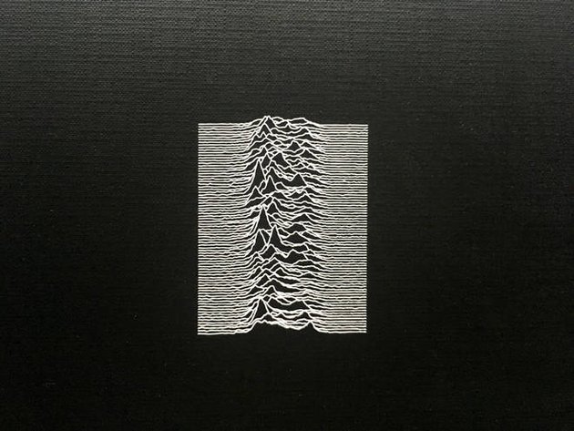
I am going to make a poster of her sleeping patterns after 365 days.
In a mathematical sense, the graph you see on the album cover is called a stacked plot, or in popular terms, Joyplot.
The graph on their cover represents the density of the radio emissions given out by a pulsar, a “rotating neutron star”.
The idea built itself in my mind in a matter of seconds. Each line representing a whole day, and the bumps representing the sleeping patterns. I knew I had to do it.
Getting the input
Clearly, I had an issue.
How was I supposed to get the data? The first thing that came to mind was getting the Android apk file, unpacking it and searching for a possibility to extract the data from the internal database, if there even was one.
But maybe it’s easier to contact the developer and ask for my data.
After less than 24 hours I had a response in my email inbox. Apparently, there was already a possibility to export all of the data through the app itself. I just didn’t expect it, so I didn’t look for it.
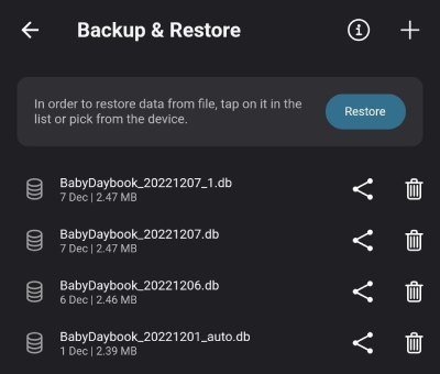
I opened the application settings and there it was. A raw SQLlite .db file which I could share through my cloud storage provider and download on my PC.
Let the fun begin!
Transforming
Since I felt comfortable with backend and frontend JavaScript, I found it ideal to use it for this little project. Before adding a server that would host the data for the front-end, I needed to filter and change the data to fit my needs.
Firstly, I took the formerly mentioned SQLite file, imported it and exported only the table with the data which I needed. The output format which I knew I wouldn’t have problems with was csv.
Reading and parsing
This is quite straightforward in node. The result which I needed was an array of objects containing the Date objects when the sleep changed its state and the boolean indicator if it started or finished.
Parserjavascript
const file = fs.readFileSync("./data.csv", "utf-8")let lines = file.trim().split("\n")lines = lines.map(line => line.split(","))let data = lines.filter(line => line[5] === "sleeping").map(line => {return [parseInt(line[6]), parseInt(line[9])]}).map(item => {return [new Date(item[0]), new Date(item[1])]}).reduce((agg, item) => {return [...agg,{mode: true,time: item[0],},{mode: false,time: item[1],},]}, [])
Calculating density values
I decided to split the day into 5-minute intervals. Each interval is represented with its starting DateTime object.
The density chart used by the frontend library will need an array of values for each day, with each value having one of the two states:
- null (my daughter is awake)
- X (my daughter is sleeping, with X being the n-th element in that array)
This means that a sample array would look something like this.
Sample formatted arrayjson
[{ "time": datetime1, "value": 1 },{ "time": datetime2, "value": 2 },{ "time": datetime3, "value": null },{ "time": datetime4, "value": 4 },{ "time": datetime5, "value": null },{ "time": datetime6, "value": 6 },{ "time": datetime7, "value": 7 }]
And it was achieved by this pile of code.
Data calculationjavascript
function getDayDiff(startDate, endDate) {const msInDay = 24 * 60 * 60 * 1000return Math.floor(Math.abs(moment(endDate).startOf().toDate() - moment(startDate).startOf().toDate()) / msInDay)}let startDate = new Date("2021-12-12T00:00:00.000Z")let endDate = new Date("2022-12-12T00:00:00.000Z")let currentDate = startDatelet dates = []let mode = falselet dateIterator = getDayDiff(startDate, currentDate)while (currentDate < endDate) {if (getDayDiff(startDate, currentDate) != dateIterator) {dateIterator = getDayDiff(startDate, currentDate)}if (data.length &&moment(currentDate).add(5, "minutes").toDate() >= data[0].time &&mode === false) {mode = data[0].modedata.shift()}if (data.length &&moment(currentDate).subtract(5, "minutes").toDate() >= data[0].time &&mode === true) {mode = data[0].modedata.shift()}if (!dates[dateIterator]) {dates[dateIterator] = []}dates[dateIterator].push({time: currentDate,value: mode ? 100 : 0,})currentDate = moment(currentDate).add(5, "minutes").toDate()}for (let i = 0; i < dates.length; i++) {for (let j = 0; j < dates[i].length; j++) {dates[i][j].value = dates[i][j].value === 100 ? j : null}}
Serving
I spun up an HTTP server which I wanted to serve the data to the front-end. Using the NodeJS http module was all I needed to serve the csv content which was prepared earlier.
server.jsjavascript
const http = require("http")const requestListener = function (req, res) {const headers = {"Access-Control-Allow-Origin": "*","Access-Control-Allow-Methods": "GET","Access-Control-Max-Age": 2592000,}res.writeHead(200, headers)res.end(csvData)}const server = http.createServer(requestListener)server.listen(8080)
Consuming and drawing
For the front-end part, I decided to use the most popular charting library, called D3.js. Their basic example of a ridgline plot was enough to get me started. I just needed to reverse-engineer what was going on to know how the data should be prepared.
Frontend codejavascript
let max = 0const scale = 0.001var allDensity = []var kde = kernelDensityEstimator(kernelEpanechnikov(1), x.ticks(60))for (i = 0; i < n; i++) {key = categories[i]density = kde(data.map(d => d[key]).filter(item => item !== "null"))const maxDensity = Math.max(...density.map(item => item[1]))const factor = scale / maxDensitydensity = density.map((item, index) => {const noise =item[1] == 0? item[0] > -70 && item[0] < 350? Math.random() * 0.0001: Math.random() * 0.0001: Math.random() * 0.0005const finalFactor =(item[0] > 60) & (item[0] < 230) ? factor / Math.log(n / 50) : factoritem[1] = item[1] * finalFactor + noisereturn item})allDensity.push({ key: key, density: density })}
There are a couple of things I did here.
Cleanup
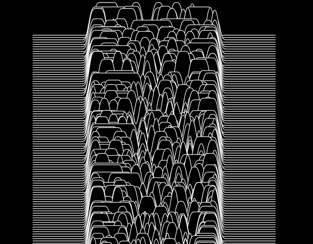
First, I eliminated all of the data points where my daughter was sleeping, because the density graph only needs data where y>0. This is done by filtering out all of the points which have values equal to null.
Data cleanupjavascript
density = kde(data.map(d => d[key]).filter(item => item !== "null"))
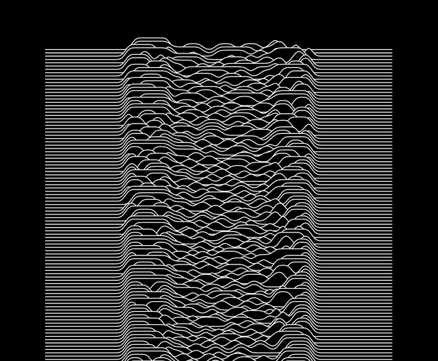
After applying this code, the chart which I was presented this looked like this.
Normalization
Then we need to normalize the data. If only a small percentage of data points are occurring on a specific day, the y-values of those points will be high to show higher density around that period, which we don’t want to achieve. We want the y-axis to have the same maximum throughout the whole chart.
This is done by calculating the factor by which we need to scale each data point, taking into consideration the maximum value of each day.
Data normalizationjavascript
const maxDensity = Math.max(...density.map(item => item[1]))density = density.map((item, index) => {const finalFactor =(item[0] > 60) & (item[0] < 230) ? factor / Math.log(n / 50) : factoritem[1] *= finalFactorreturn item})
As you can see, I’m not applying the same factor throughout the whole day. I want to keep the beginning and end of the day high up because this is ‘regular sleep’, and the middle of the day scaled down. The logarithmic scale is used to gradually increase the factor across all 365 days.
After this step, the chart began to look like something I had envisioned, but it still lacked one final step.
Noise
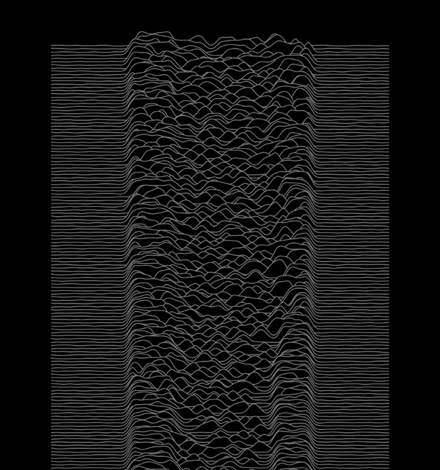
If you take a look at the album cover mentioned in the intro, you will see that the curves are not regular, but have a bit of noise. We’ll achieve this by applying a minor random delta across the whole dataset.
Since I wanted to keep the middle of the graph in focus, I applied a larger noise on it, and keep the sides with a lower intensity.
Noise generationjavascript
density = density.map((item, index) => {const noise =item[1] == 0? item[0] > -70 && item[0] < 350? Math.random() * 0.0001: Math.random() * 0.0001: Math.random() * 0.0005item[1] += noisereturn item})
The output
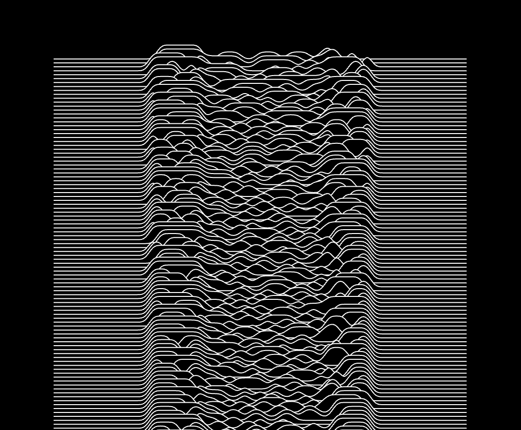
As I started the server, it crunched the data and served it on http//localhost:8080. I opened the HTML file which contains the front-end JS code, and it served an image like this one. Take into consideration that on each page refresh you get a chart that was a bit different, because of the noise generation.
Touch-up
For the finishing touch, I booted up Adobe Photoshop.
During this year’s literature fair, called InterLiber, I stumbled upon a stand that was owned by the Chinese Embassy. They had hosts which were kind enough to write down Croatian names using traditional Chinese calligraphy, so I gave them my daughter’s name.
The result was so visually appealing to me that I had to scan and add it to the poster along with some other minor details.
Final result
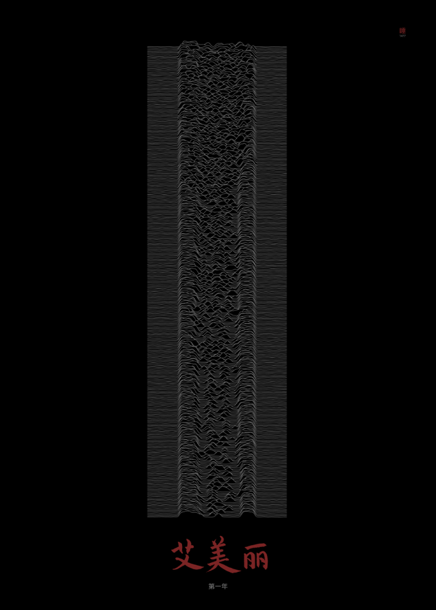
All that I did after this was export it to the tiff format, put it on an USB drive and brought it to my local printing shop. A couple of days later I picked it up and placed it in an IKEA 50x70cm picture frame I had lying around.
I heavily enjoyed creating this and am surely going to keep producing visual art supported by code.
Who knows, maybe I’ll write up a post about the 3D poster which I had made in Blender as a gift to my wife while I was waiting on them to come from the hospital a year ago. 😉
If you enjoyed content like this, leave a couple of ❤️.
Cheers!


